MoMA Lesson #2: Interface Design and the Path of Least Resistance
By
Josh Clark
Published Jan 22, 2007

I enjoyed a great visit to New York’s Museum of Modern Art a couple of weeks ago and, along the way, picked up a couple of useful lessons about design process. I posted already about lesson #1, story-driven design. Herewith, lesson #2.
MoMA comes with a free audio guide if you want one. Special icons on wall texts indicate the artworks that have an audio commentary available; punch in the appropriate number, and a MoMA curator whispers insights about the art into your ear.
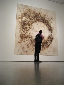
Here’s a behavior I observed many times over the course of my afternoon visit: Visitors gripping their audio handsets walked quickly through the galleries, scanning wall texts until they found one with the audio icon. They punched in the number, stepped back to look briefly at the work, then ambled around the gallery, wayward eyes roaming the ceiling, the floor—everywhere but the art—as they listened to the commentary.
These audio-obsessed visitors barely glanced at the described art; any works without audio were ignored completely.
For these folks (and it certainly wasn’t everyone), the museum visit was dominated by the audio guide and seemed only loosely linked to the art itself. The support materials became the main event.
My wife Ellen is an art historian and a professional museumgoer. She tells me that museum visitors commonly spend more time reading wall texts than looking at the art. Similarly, Steve Delahoyde refers to a study suggesting that museumgoers spend more time with individual items in the museum’s gift shop than with individual artworks.
It’s a law of interface behavior that users will always follow the path of least resistance. Looking at art is hard. Many find it intimidating, unfamiliar, uncomfortable. It’s easier to read wall text, go shopping or listen to audio commentary than it is to actually face down the work itself.
The interface is broken.
The support materials should be less prominent. What a work “means” or why it’s “important” is second-order information. The important experience is simply to look at the work, to absorb its sensual impact. Respond to it, rather than study it like a schoolbook. For lots of visitors, though, the support materials seem to distract, reducing the time that visitors take to reflect on the works.

The design question: How do you get people to consider the art instead of plunging into its documentation?
This is fascinating to me, because it’s the exact opposite question that I’m typically faced as a software designer. Normally, you can count on the fact that people will rarely read a user manual or instructions on the screen. They prefer to plunge right in and play with the software til they figure it out. Since they won’t read the instructions, my challenge is to make the interface easy enough that no instructions are necessary.
In art museums, though, there’s a strong tendency to avoid plunging in, and many actually prefer to “read the instructions” instead of enjoying the art.
Some time ago, Matt Linderman of 37signals commented that he wanted wall text to be more prominent:
I feel like there’s a bug in the typical museum experience. I don’t like that you see and experience a piece of art before you learn its title.
When you read a book, the title isn’t put on the last page. When you see a movie, the title isn’t revealed during the closing credits. Yet when you go to a museum, titles take a backseat…. As a viewer, you’re virtually forced to soak in the image without knowing what it’s called.
He suggests making this information more prominent, perhaps providing audio to alert you to the title as you draw near. Me, I think that it would be better to make wall text less prominent, encouraging visitors to spend their time with the art instead.
The modern art museum in Paris, the Centre Pompidou, uses an architecture of control that does just that. Each gallery has a stand with a set of cards offering commentary on the works in the gallery. The wall text is limited only to title, artist and materials. The behavior of museumgoers changes: People walk into the gallery, and spend time with the works. Afterward, those who are curious to learn more go retrieve a card and return to look at the works some more after reading about them.
The educational and background materials are still there, but presented in a way that still encourages people to confront the works first.
Of course, if people prefer to read wall text rather than look at the art it describes, that tells us something about the experience. It’s hard to look at art. Many people are skeptical, even suspicious, of it. And when it comes to contemporary and modern art in particular, many are hostile to the craft itself (“my five-year-old could paint that”) or feel that they’re missing the point (“but what does it mean?”).
Practice makes perfect, though, and the only way to get past the discomfort is to spend enough time looking at art that you finally relax. Giving people audio guides won’t do the trick, and neither will lengthy wall-text commentaries.
For years I too found museum visits to be tedious going. It was an activity that I was supposed to do, a periodic booster shot of culture. I alternated between the hostile impression that the artist was a fraud and a sense of disappointment that I was somehow not sophisticated enough to “get it.” I was approaching the art (and the process of viewing it) too seriously, and it made me feel dumb, uninitiated.
I finally realized that the lowbrow cliché, “I don’t know much about art, but I know what I like,” is actually an OK place to start. Newcomers don’t have to know anything to enjoy art, except that someone made this object to provoke a response (I think this may be why young schoolchildren always seem delighted in museums). Do you love the artwork? Do you hate it? Is it soothing? Does it make you uncomfortable? Is it beautiful, ugly, funny, political, a comment on art itself? What’s it made of, and how did the artist put it together? Simply: Is it interesting?
Once I started looking at the art just to look at it, just to enjoy my own response, I started enjoying the process more. A lot more. And I no longer needed the wall text or audio guide as a crutch. That change in perspective changed the entire museum “interface” for me. The museum experience was suddenly accessible enough that it no longer started and ended with wall text and audio guide.
But it only happened after I started to really look at the art, setting the secondary materials aside. Maybe it’s not so different from web software design after all: When people prefer to read the instructions, it’s a warning that they’re struggling to overcome a hostile experience. Time to figure out how to make it more pleasant.


